Dark cave

With Volumetric Lighting, invisible boundaries and use of the Copy tool one can make interesting scenes.

Crystal Room

Simply lighting effects, the right textures and the right camera position can bring out a simple room very nicely.

Stained glass

Stained glass in the light of a sun can give cool patterns. A nice experiment.

Vases

By experimenting with certain settings, one can quickly transform a sphere into a flower.

Decorated wall

Decorations are common and surprisingly quick to make. Tehy really bring a good atmosphere.

Friday, 14 August 2015

Tutorial: Chess - Part 2: Pawn

For our 2nd part of the Chess tutorial, we'll be making Pawns. They come in great numbers and have the ability to become anything. And because they take up half of the entire army, they're the most logic place to start off.
1) Pawns are fairly easy in design. They're basically a cone with a sphere on top. So that's where we'll start. Both can be found in the Objects section.
2) we'll place the sphere on top of the cone for now and tick it off, so we won't see it. The cone will be our main job for now. You can tick objects on and off by clicking the checkmark or the red X next to the item.
3) I want to edit this part in detail with my hands, instead of with numbers. It might be taking the hard way according to some, but it gives me a better feeling and more control over how it'll look. That's why I'm going to use just 10 Height Segments for now and move to the Front viewport, which will make it easier. It doesn't matter whether you go to Front, Back, Left or Right though. And of course, we'll make it Editable.
4) Next I'll zoom in a bit, select the Point Selection and toggle off "Only Select Visible Elements". This'll make sure I can grab everything behind my point of vision as well.
5.1) Since a pawn has a slightly bulb-like bottom, that is what we'll go for. Now I'll select the bottom row and drag it inwards, shrinking it with the Scale too to roughly 70%. This'll be a few short sections with more pictures than explanation, as it doesn't need any explanation.
5.2) The row above will be dragged down 10cm but stays at the original size. This'll be the first "ring".
5.3) The 3rd row goes about 17cm down, ending the first ring. Scaling it down with 90%.
5.4) The 4th will go 20cm down and scale up to 120%.
5.5) Row 5 goes roughly 25cm down and gets scaled up to 110%.
5.6) The 6th will just go down with 20cm.
5.7) And the 7th just moves down 10cm.
5.8) The 8th row goes down roughly 29cm.
5.9) And the 9th will slide down 20cm.
5.10) The 10th lowers 10cm and scales up to 250%.
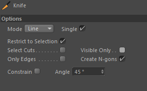
5.11) Now I want two more lines to work with for the final part. So I'l use the Knife tool. Again, deselect Visible Only. I use Shift to make a straight line and cut two more lines on top. It doesn't matter where exactly, as you'll have visuals where I'll place the lines in the end. You can use that as guides to place yours if you want an exact copy.
5.12) Now that we have an 11th and 12th rows, we'll have the 11th line scale up to 180% and lowered roughly 7cm.
5.13) To match the size, the 12th row will be scaled up 380% and lowered 10cm.
6) We now have a very rough Pawn model. It still doesn't look that good though... very pointy. So let's see how a Subdivision looks.
7) A lot better already. But it still needs its head to make it look better. Thus we'll add the sphere back, by checking the X back on.
8) It's way too big now obviously. So I'm scaling it down to 50cm and dragging it down to be on the right height. Which for me is about halfway down the top section.
9) Now traditionally, the pawns head is a little dented on top. So let's just do that as well. But instead of editing the sphere and making it harder for ourselves, a Melt Bender would give a good effect as well. Any strength between 1% and 5% works pretty good. I'm going with 2%.
10) However for the 2%, it's a little bit too big again. So I'll scale the sphere down another 20%. This is more nitpicking from my side though, which is what I enjoy doing with these projects.
11) Any chesspiece does have a piece of felt under it. So we'll need to do that as well. As it's a circular piece which is the same size as the bottom, a simple Cylinder will do.
12) We'll start off with resizing it to 70cm radius and just 1cm in height for now.
13) I do want the felt to be more than just a cutout piece, so I'll give it a falloff as well. I'll scale the bottom down 2,5%.
14) The pawn is finished, I'll just name every object, add it all together in a Null Object and save it. Texturing will come later.
I hope you enjoyed this tutorial! If there are any questions, feel free to comment.

Saturday, 8 August 2015

Tutorial: Softbox

Light can be difficult to master. Specially if you don't want to set up a particular scene, but just one mode. For this, a Softbox is frequently used. Those familar with photography will know a Softbox. For those who don't, it's one of the most popular tools for light shaping. They can cost quite a lot, but luckily we can simply make one for our models. Like the one below for example. As you can see, the Spheres have a small, white square within them. This is the Softbox we'll be making. I used a different light in this scene for the shadows however, as the Softbox was positioned directly above the table to make it visible in the spheres.
1) We'll start with creating 3 Rectangles.

2) We'll place them on the XZ Plane and name them Small, Big and Medium with the sizes 50cm, 1200cm and 1500cm respectively. They'll have an Angle radius of 5, 10 and 15, which you can find below the Intermediate Points setting.

3) Next, place the Rectangles above each other and spawn a Loft object. The Loft can be found on the top row, under the Subdivision tools. Now put them together, which can simply be done by dragging each Rectangle under the Loft. Nothing needs to be changed on the Loft.

4) You can now play with the distance the Rectangles are apart. This'll influence the physical appearance of the Softbox, not the effect it'll have. So it's purely optional. I set mine with the Loft centered this; Small 400, Medium 180 and Big -270. These are all Y axis values so you'll have to fill it in in that section of the Coordinates.
5)For the next step you'll need a Plane, Area Light and a Null-Object. The Plane and Null Object can be found under the same icon for Objects. The light obviously will be under Light.

6) The Plane and Light both go on the same Y axis. Which will be 5 under the Big Rectangle, 1495 on the Y axis for me. The Plane is the same size as the Big Rectangle as well. Our Area Light has Area shadow and 80% Strength. The Light details are 750 for outer radius, 1500cm in both X and Z sizes. Check Inverse Square on and set the Physically Falloff to a 1000cm radius. I've put all of these changes in the picture as well.

7) The Softbox is already almost done actually! We just need to put a texture on it now. Which is very easy. Open one Texture Material and check off the Colour and Specular. We'll just need a Luminance. This Luminance will have a Gradient Texture, so select that one. The Gradient will be a 2D - Circular type with the following colours in order of position on the scale: 100% White, 80% Gray and 38% Gray. You can play around with these of course, however you want. It'll affect the colour of the light only slightly. Just make sure there is a good falloff in the colour, like this one. Put the texture on the Plane and you're done.

8) Now just put the Light, Plane and the Loft under the Null and I'll add a Composition Tag to get rid of any shadows the Softbox might cast on the objects. Sometimes it happens, other times it doesn't. Best to be save.

And with that, the Softbox is done already! But, just in case, why don't we test it out? There is a very easy way to test a Softbox in Cinema. Any light can be tested easily with this. If you don't care to test the Softbox, or are sure it works already, my work is done. For those who stop here, I hope you enjoyed this tutorial and enjoyed it! If there are any questions, feel free to comment anyway. For those who do want to test it, keep reading!
9) Lift the box up higher through the Null. I usually have the height set quite far above the ground so the sphere of the light doesn't touch any objects. I find this to be a good balance point for the light to be, as it will have a good effect on the objects yet not overlight them. Next we'll import the White Background, for which I made a tutorial earlier. It can be found >>Here<< (page opens in the same window). Finally, we'll add a simple Sphere to this scene. Give it a new Texture, where all we do is add a Reflection. Nothing else needs to be done. the scene will look like this.

And as an end result, you should get something like this. As you can see, the Sphere is half-white due to the white background and half-black because I have no sky. However you can see one white square in the Sphere, which is our softbox!
And with that, my work is done. Completely this time. I hope you enjoyed this tutorial! If there are any questions, feel free to comment.

Sunday, 2 August 2015

Tutorial: White Background

If one wants to show off a model, it's useful to have a solid background and floor for shadowing. Now of course, you can simply put anything in there. I used to go with an outdoor-asphalt look or tiled room. There was always a hard border though. The horizon, closed in walls or just a simple line that suddenly stops. However some time ago, I found a quite easy tutorial on how to make the illusion of an infinite world. So I'll share it on here in my own words.
To start off, let's look at the finishing product.
As you can see, it's a light-gray floor with a white spot in the center. The magic here is, no matter from what angle you render, it'll be the same. I'll show it through several other renders, with a simple cube and a light with a hard shadow.
As you can see, the ground will stay the same even from the immediate side or when looking up. Making this, is incredibly easy.
1) Start by placing a Plane (Under objects) and a Background (Under Floor). This'll be all you need to place.
2) Select the Plane and go to Tags on the top right and select CINEMA 4D Tags. Here you have to select Composition. Composition is a very useful tool when making scenes where shadow is a big factor. For this tool we want to deselect Self Shadowing and Cast Shadows. In the case you're going to use a light, the Plane might cast a shadow on a lower object. This is just to be safe. It's important to select the Compositing Background box. This'll cause the object the tag is on to blend in with the background so far it's possible.
3) So now the texture. Very easy to do. All you need is one Texture material. Make the Colour texture a Gradient. This Gradient will be a 2D - Circular type. The Gradient can be coloured however you want, but for the sake of effect I suggest choosing two colours not too far from each other. Like how I use white and gray. We'll also be adding a Luminance, which will be 70%. That's all.
4) Now that the Texture is done, apply it to both the Plane and the Background. Set the Projection to Frontal, and you're done! That's all.
Now if you want, you can place a block in the middle with a Light (Hardtrace Shadow) to test it. Otherwise my work is done. I hope you enjoyed this tutorial! If there are any questions, feel free to comment.